
Teal Appeal for Spring Updates Around the Home
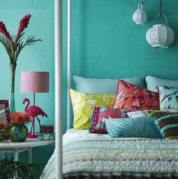
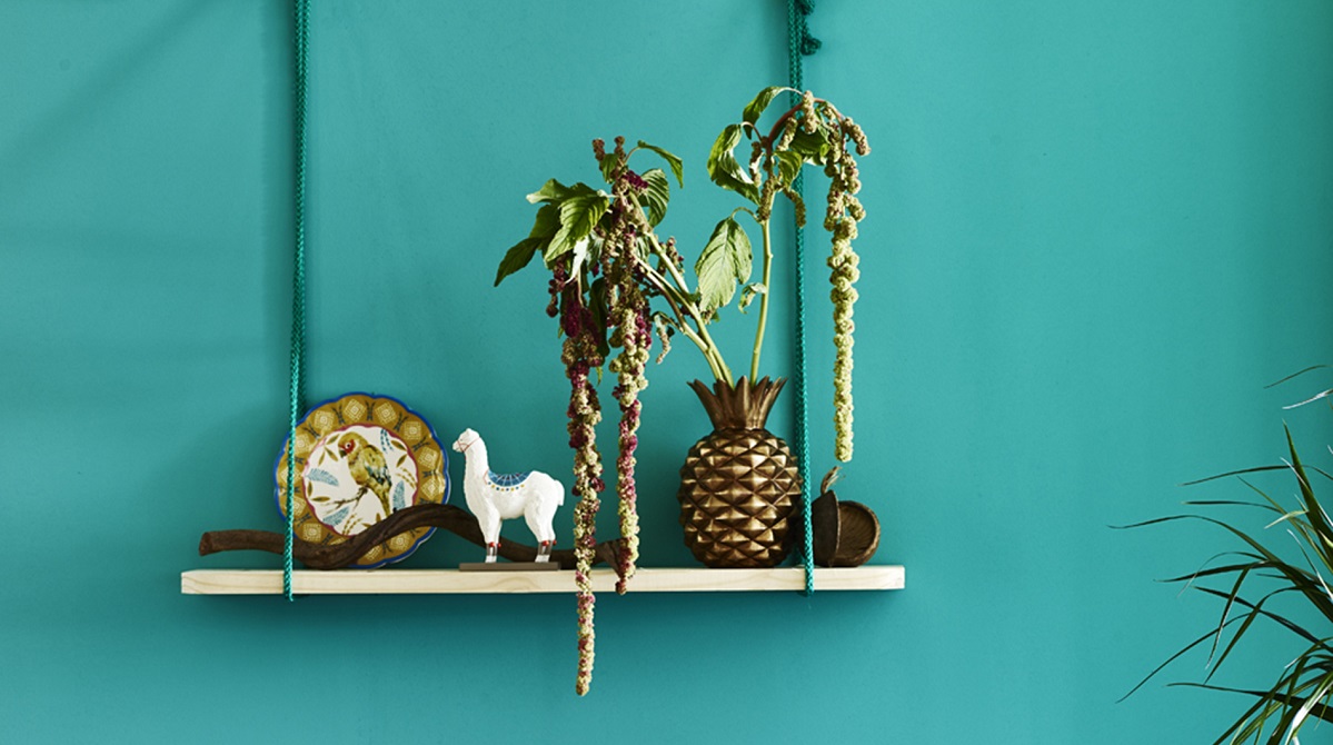
Teal is not normally a colour that I’m naturally drawn to. It’s a bit loud for my tastes to be honest. I sometimes admire it from afar but never get tempted to buy a tester pot and try it out at home. It’s for holidays. It’s that intense turquoise of tropical seas. The colour of wooden shutters on those picturesque little white-washed Greek houses. It’s for summer and sun, and much too intense for our cool, temperate climate.
But I might be wrong.
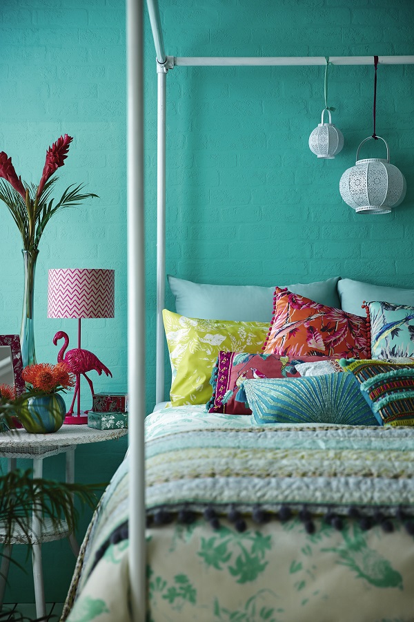
Bohemian styling from the Debenhams spring collections
Winter is taking its toll and I’m noticing that this particular shade of blue is uplifting and cheery, and maybe just a bit exotic. I like the way it lends itself to touches of oriental and bohemian styling. And I love the way it clashes with equally intense raspberry colours and shades of red! It’s a colour that can take strong pattern and layered textures and cries out for flamingoes, and pineapples, and hot-house plants.
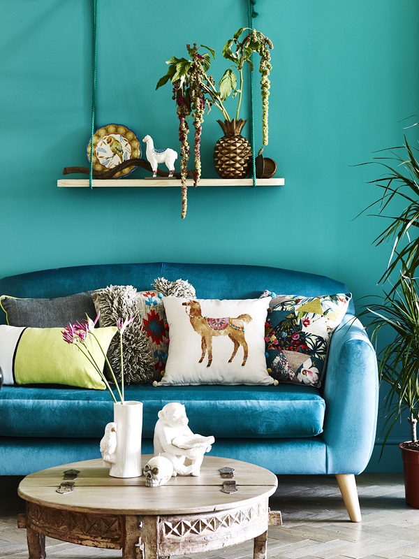
A touch of the exotic from George Home this spring
A touch of white goes a long way to cooling down this explosion to the senses. But don’t add too much or it will dilute the effect. A few accessories, a lampshade or a cushion is all that is needed.
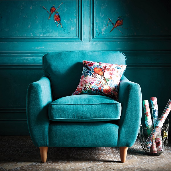
Teal on teal from Very
But if all of this teal is too spicy for your tastes, don’t worry. There is a way to introduce it into the home without shocking the neighbours. Use it as an accent colour on one stand-out piece of furniture. It’s a great colour to liven up a neutral scheme or to create a statement, and any one of these pieces would look sensational in a hall to welcome guests, or in a living space to draw the eye.
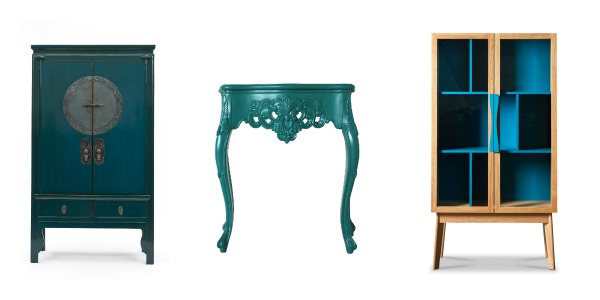
From left to right: Orchid Furniture, Out There Interiors, Swoon Editions
Or use accessories to introduce the colour in a much more subtle way.
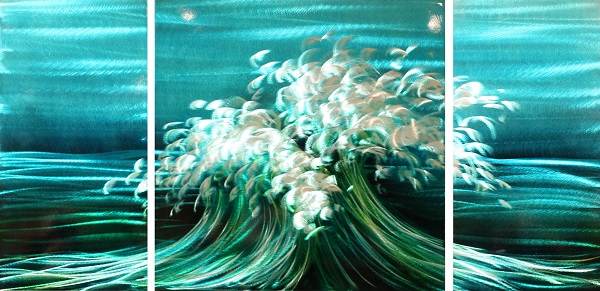
Not so subtle triptych from Arthouse
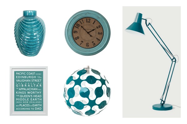
Clockwise from top left: The Contemporary Home, Puji, Made.com, Grinne Lyons Design, Betsy Benn Designs
I might be a convert. How about you?

I love Teal! And I am rather delighted its made it back to trend. I have a slightly more muted but no less bold version than your images in my hall which changes to pale grey through the main hall and then I have a feature wall on the stairs in it again. It is a great backdrop for bold art too it features in my blinds and my floor and it looks magnificent – well I think so! It has had a lot of compliments and its been like this for a few years. I’m certainly no colour conventional though….
I’m glad someone likes it enough to go for it Bridgette. Sounds lovely ?
I love this colour but I would definitely use it as an accent. I wouldn’t use it all over the room! ?
That seems to be the general consensus Lynda ?
Lovely shots, I like accents of the colour but not sure I could do a whole room. I need to be braver! X
Must say, I feel the same Cate ?
I have had a teal velvet loveseat for the last ten years and I loved it! It brought just the right amount of colour and statement to the room without being overpowering. Love some of these styled shots x
Ooh I so love velvet Katy. It sounds lovely. x
It’s gorgeous, but i’m not sure I could handle it as an entire room colour. I have a client who’ds like bedroom to be completely teal, so who knows…. maybe i’ll get to see if for myself soon enough!x
Doing it for a client is the best way to try it out Karen lol. You don’t have to live with it. x
It looks amazing – in other people’s homes and in warmer climates. The colour itself is gorgeous, but I just couldn’t see myself living with it ?
Haha, I’ve just read your last post on white walls Carole and now you’ve turned me. xx
Stunning styling and a beautiful colour. Sometimes I wish I could pull myself away from white x
Maybe we should stick with what makes us most comfortable Karen. At least white is never tiring. ?
It most definitely brings Mediterranean seas and skies to mind. I love the paint colour in the first photo, it’s a bit brighter than I traditionally think of teal being. I probably couldn’t decorate entirely in teal, but a nice splash of it here and there would be lovely.
I’d agree with that Rachel. A splash of it might be all I could manage at home. ?
I just want to jump in that Debenham’s bed and submerge myself in all that glorious colour!! I love the shots here and how they are styled (George Home?! I can’t believe how trendy it is!!). I used to have a lot of turquoise in my home a few years ago but tired of it after awhile and ended up losing nearly all of it (preferring indigo which is probably a little more suitable to our climate!) but when I see it like this, it really does look gorgeous. It’s just such a happy colour! xx
You’re so right Kimberly, it is a happy colour! Was your teal period around the time we photographed your home for Heart Home? I seem to remember you dressing room being that colourful haha Might be time to bring some back? x
I really like the colour Carole but wouldn’t have thought to use it in the home… looks fab in these shots though!! x
Same here Kate but I really wish I could be more adventurous with colour sometimes x
Very on trend Carole – especially as it’s one of Farrow and Balls new colours. xx
Is it really Pips? Must have missed that one ? x